
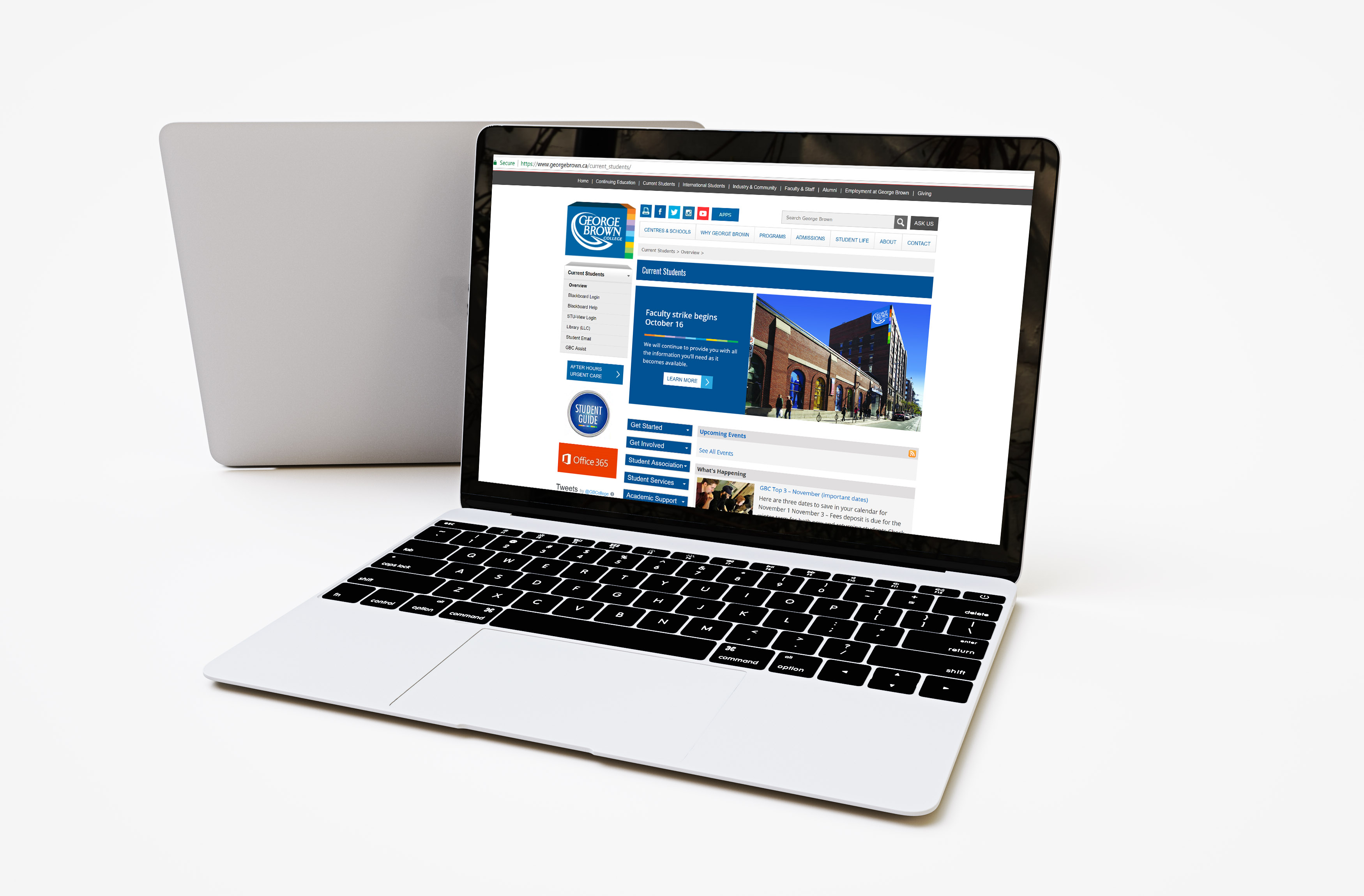
Overview
The Current Students Page is a page in George Brown College web site that contains essential information and services for students who are currently enrolled. This page has a very critical role as it is the main information hub for both new and returning students. A usability testing was conducted to find pain points and ambiguous areas and an effort was made to recommend the best possible solution so that students can make the most out of the page as well as enjoy using it.
Scope
- Develop and perform usability testing for Current Student page
- Recruit student participants
- Record and analyze data
- Provide recommendations for site improvements
Scope
- Develop and perform usability testing for Current Student page
- Recruit student participants
- Record and analyze data
- Provide recommendations for site improvements
Test Design
Pre-Testing (5 Min )
Pre-Testing (5 Min )
• Thank participants for giving their time to the study
• Briefing participants about the
purpose of the study
• Signing of consent forms
• Participants complete the Pre-Questionnaire
• Thank participants for giving their time to the study
• Briefing participants about the
purpose of the study
- Signing of consent forms
- Pre-Questionnaire
Testing (45 mins)
• Participants screens and responses are recorded
• Participants perform tasks given
• Participants think aloud during
their tasks for response recording
• Completing testing questions after each task
• Participants screens and responses are recorded
• Participants perform tasks given
• Participants speak aloud during
their tasks for response recording
• Completing testing questions after each task
Post-Testing (5 mins)
• Participants complete the Post-Questionnaire
• Participants are debriefed about
the testing
• Gift cards are given to participants
as a “Thank you” for their time
• Participants complete the PostQuestionnaire • Participants are debriefed about the testing
• Gift cards are given to participants as a “Thank you” for their time
USER EXPECTATION VS CURRENT DESIGN
USER EXPECTATION VS CURRENT DESIGN
USER EXPECTATION VS CURRENT DESIGN
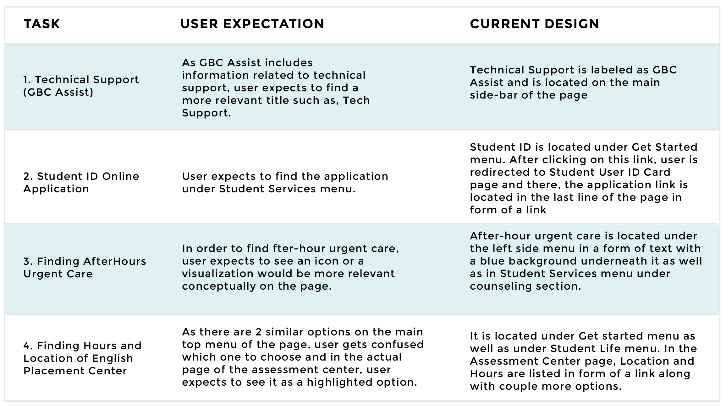
Pain Points
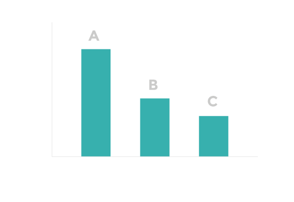
TOP 3 TIME CONSUMING TASKS
TOP 3 TIME CONSUMING TASKS
TOP 3 TIME CONSUMING TASKS
TOP 3 TIME CONSUMING TASKS
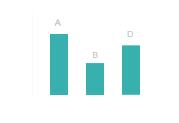
TOP 3 DIFFICULT/ERROR INDUCING TASKS
TOP 3 DIFFICULT/ERROR INDUCING TASKS
TOP 3 DIFFICULT/ERROR INDUCING TASKS
Recommendation
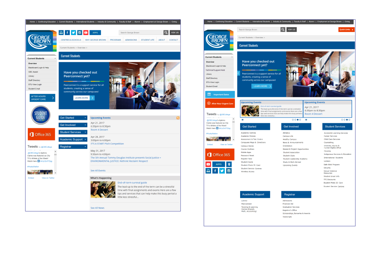
Minimizing Cognitive Load
The main menu can be put at the top of the page in a button titled as “Quick Links”. This way, user would not encounter with a menu that contains a large amount of information even not necessarily related to Current Student Page.
Additionally, by hiding this menu under “Quick Link” button, user has the chance to go through the whole page and find the actual menu that includes the services they need.
Attracting User’s Attention
“After-Hours Urgent Care” and “Important Dates” can be shown with icons and located on a red background to make them stand out.
Attracting User’s Attention
“After-Hours Urgent Care” and “Important Dates” can be shown with icons and located on a red background to make them stand out.
Increasing the Visibility
All of the options under each menu (the menus in the middle of the page such as Get Started) can be extracted and shown in the whole page under their corresponding title. Some menu items can be added to another menus so that
the process of finding an item is facilitated and user has access to all those options in one place.
Increasing the Visibility
All of the options under each menu (the menus in the middle of the page such as Get Started) can be extracted and shown in the whole page under their corresponding title. Some menu items can be added to another menus so that the process of finding an item is facilitated and user has access to all those options in one place.
Improving Accessibility
Social media icons are recommended to
be placed under side menu at the left top of the page along with an icon for campus maps to improve accessibility.
Improving Accessibility
Social media icons are recommended to
be placed under side menu at the left top of the page along with an icon for campus maps to improve accessibility.
Efficient Use of Space
“Upcoming Events” and “What’s
Happening” Sections can be combined and located in the same box under the banner. The information showing in these two sections can be presented in form of carousel to circulate data.
Same practice can be employed for the top banner as well.
Efficient Use of Space
“Upcoming Events” and “What’s Happening” Sections can be combined and located in the same box under the banner. The information showing in these two sections can be presented in form of carousel to circulate data.
Same practice can be employed for the top banner as well.
Choosing Relevant Title
GBC Assist label is recommended to
be changed to something more relevant to the purpose of this platform; for instance, GBC Technical Support would be better.
Choosing Relevant Title
GBC Assist label is recommended to
be changed to something more relevant to the purpose of this platform; for instance, GBC Technical Support would be better.
Final Result
Before
After
Thank you for reading!
Thank you for reading!
COPYRIGHT ©2016 MEHRNOUSH HASSANI.ALL RIGHTS RESERVED