Overview
This project is a redesigning process for Qatar Airways mobile app. The focus is only on improving User Experience and User Interface in finding and booking a flight.Needless to say that the original App has been changed for several times since I started to do this study.
Problem Description
Airline applications usually need to present a huge amount of data to users, such as flight date, flight time, stops, transition time, baggage allowance and so on. It is crucial to categorize this high volume of information and assure that the user has enough control over this information to reduce any friction. In many airline apps including Qatar airways app, users get overwhelmed with the high load of information that could cause frustration and lead to mistakes such as mistakenly buying a non-refundable ticket or having to pay a heavy ticket change penalty.
Research
Primary research
A few years ago, I had the chance to work in IT department of Qatar Airways. Based on my experience of dealing with user’s digital problems on daily basis, I learnt that most of clients ended up calling or going to airline offices because they couldn’t find information they were looking for in the app or on the website.
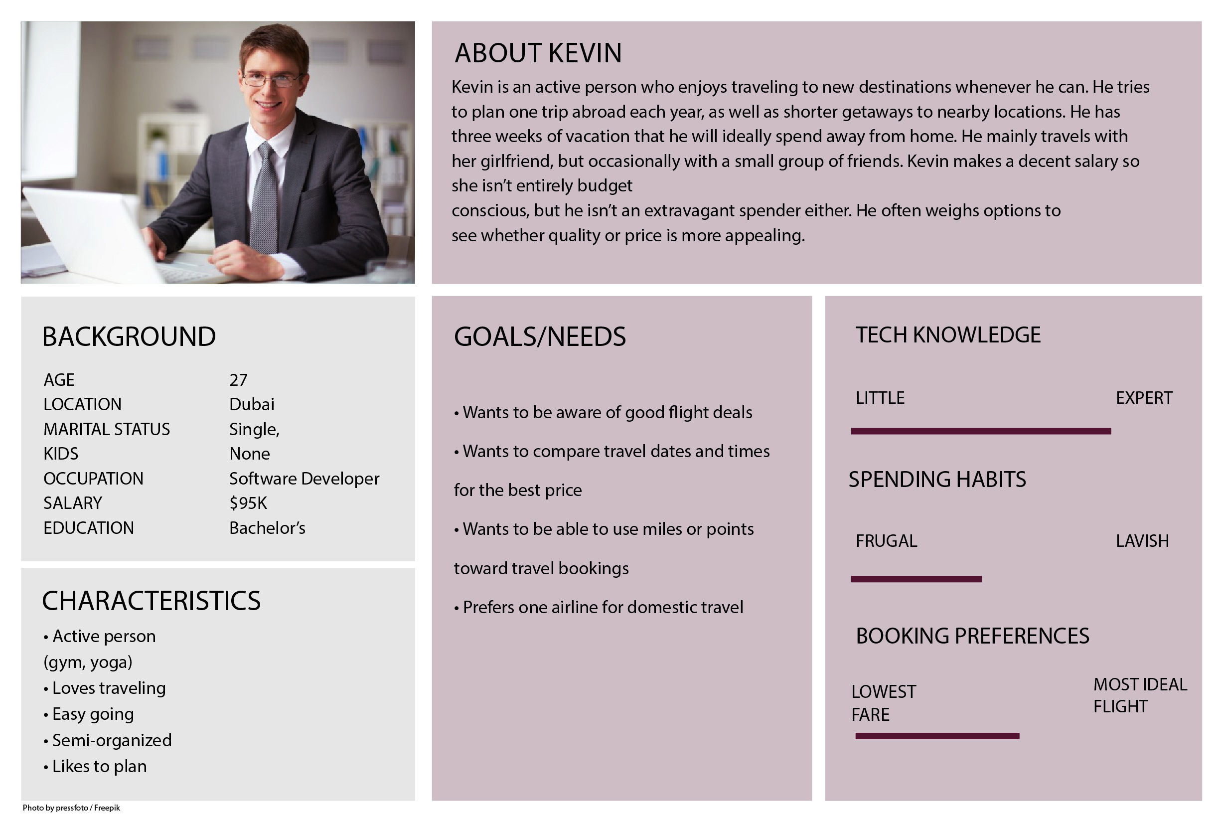
Primary Persona
Based on above mentioned experience I started to create a persona. I tried to see the app from user’s perspective and find out their needs and their frustrations.
The main issues for the users were:
- They wanted to compare the price in different dates and find the best price.
- They were confused by jargons in some parts of the app. Specifically, they didn’t know the difference between different classes of the same cabin such as Economy Value, Economy Flex and so on.
- Finding ticket fare rules such as change penalty, refund penalty and so on was difficult for them.
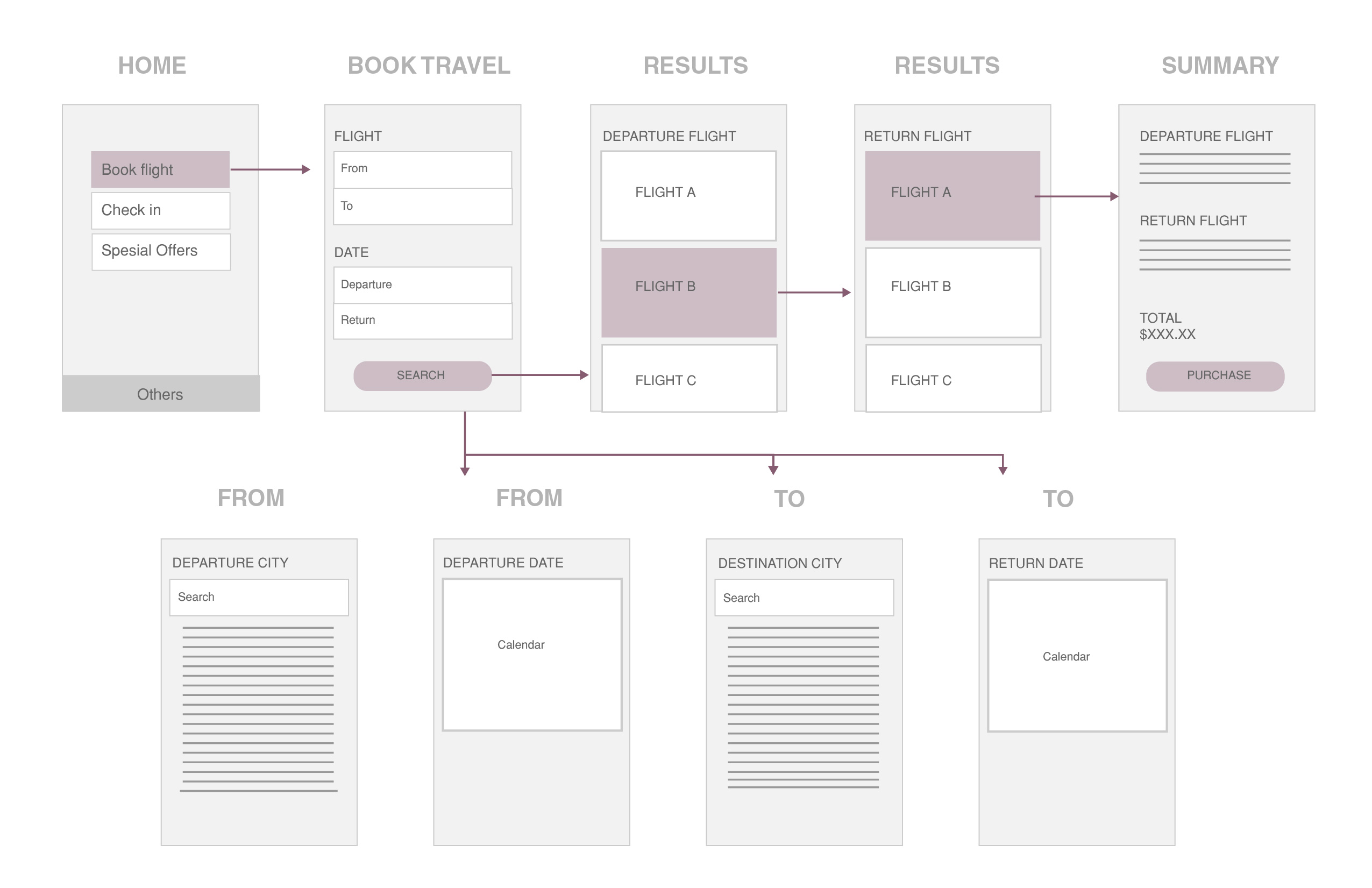
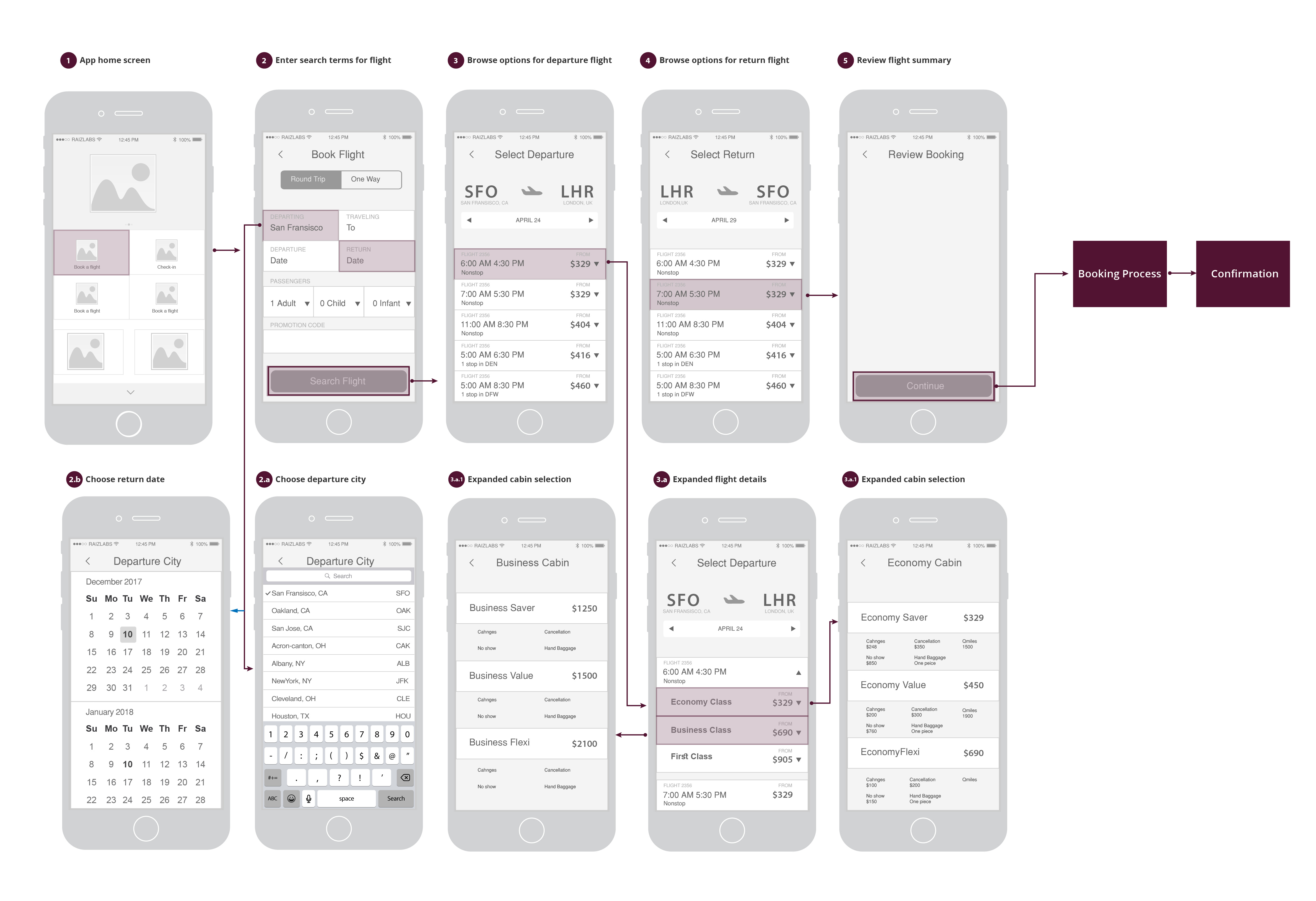
User Journey Map
In User Journey Map, I tried to break down the process into smaller steps and make it self-evident as much as possible.
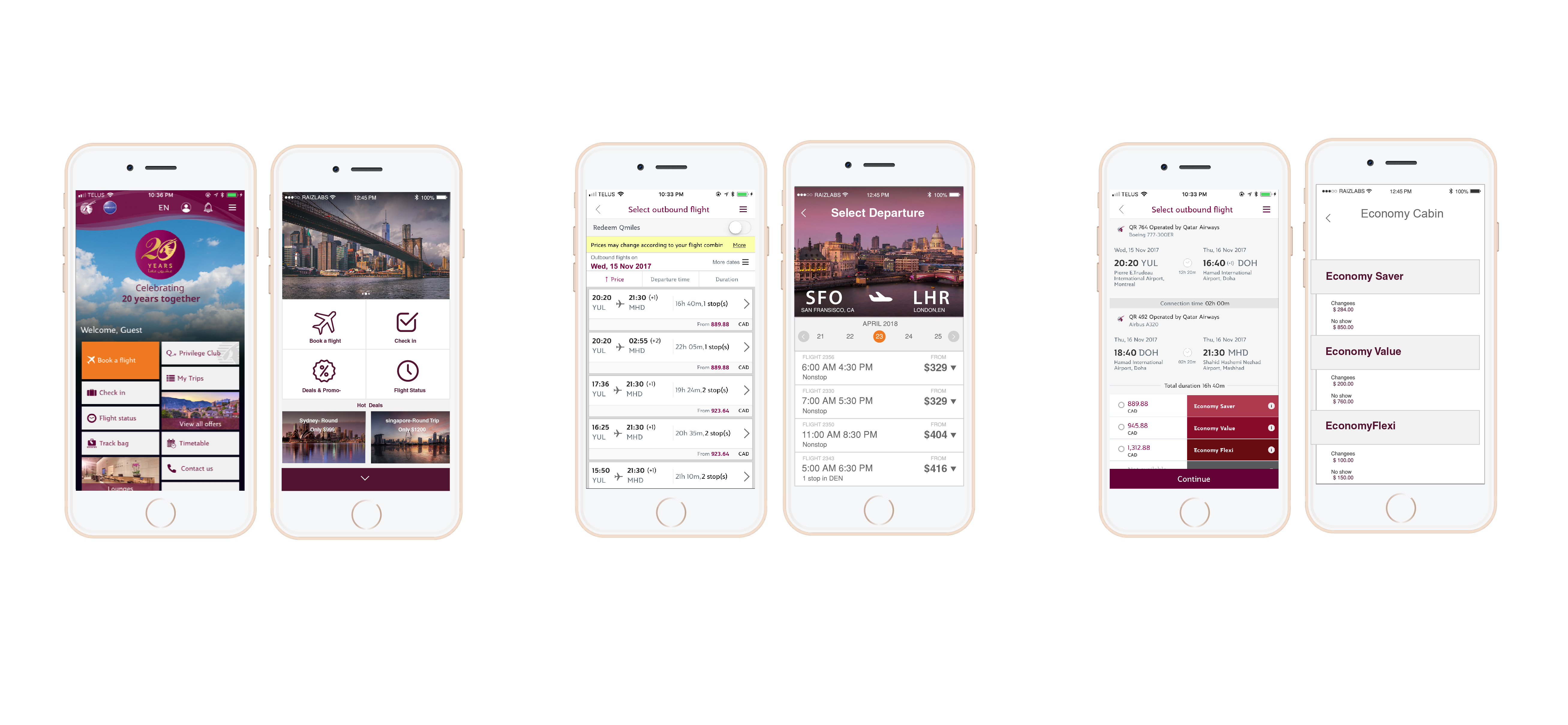
Redesigned App Features
Redesigned App Features
- To make the user capable of comparing different dates, I decided to provide a range of dates to be picked from a top bar. Users can easily swipe through different dates and pick the most suitable one.
- To eliminate the confusion caused by different types of cabin, I categorized cabins into 3 main types: Economy, Business and First class. Then I dedicated a single page for each one. In that one page, I made all the information the user may need about a certain type of cabin accessible.
- Now, even though I didn’t change the technical names of different classes in a cabins, user has access to relevant information about different classes all in one place. This way they would immediately realize the difference between each class type.
Wireframes
Mockups
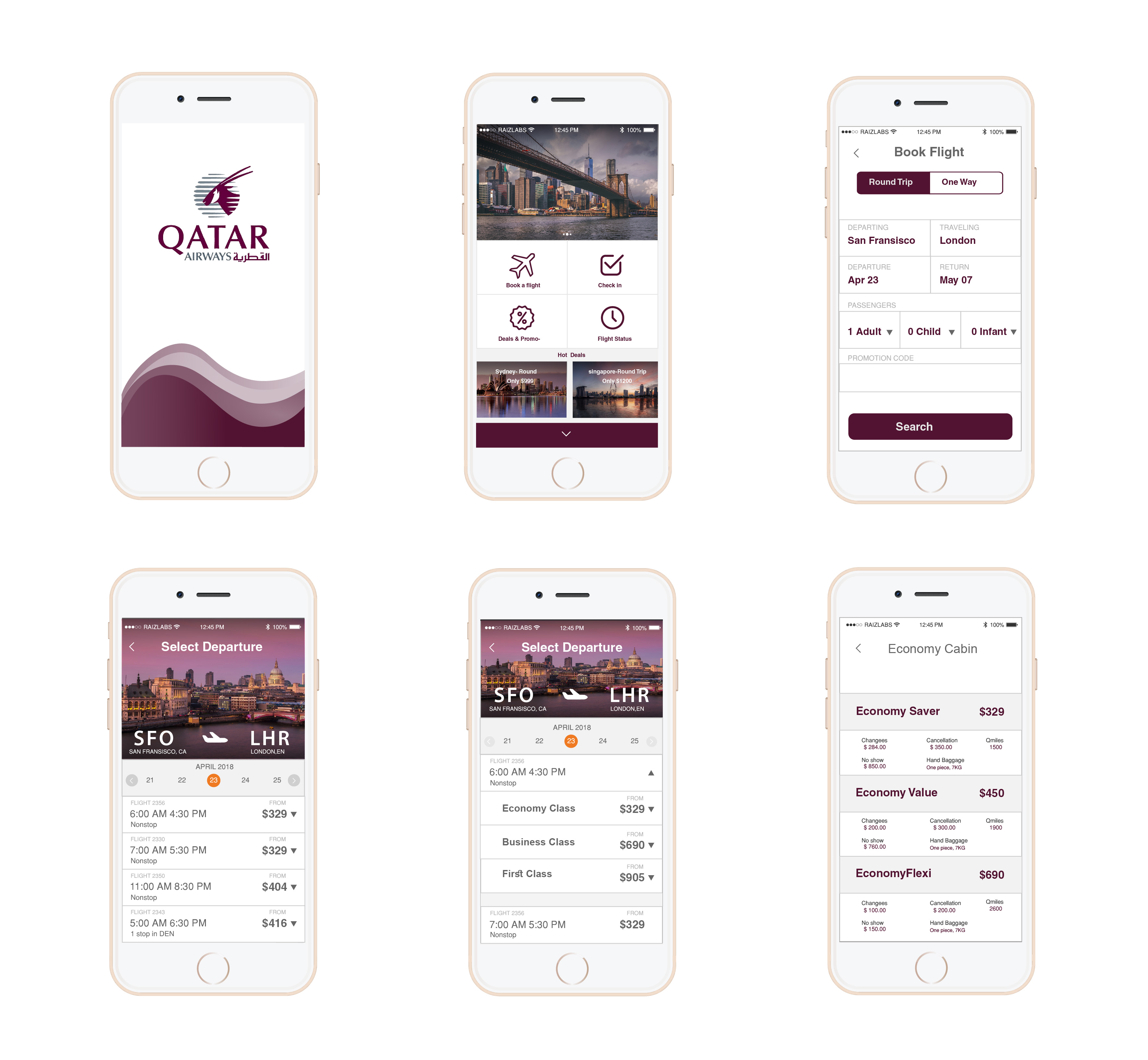
Before & after