
Overview
Porter Escape is a travel packaging platform owned by Porter Airlines. It was first created in 2014. Users are able to pick a hotel and match it with a flight through Porter Escape. They can also add activities and other add-ons such as insurance and rental cars.
Problems
- PE financial performance has been declining since 2014
- The brand is not well-established on its own
- Marketing costs are prohibitive given its low revenue base and limited network in a price sensitive market dominated by other online travel agencies
- Highly administrative in-house sourcing of hotel product, rates and invoicing
- Hotel rates are higher 65% of the time based on manual analysis and availability close into departure appears to be uncompetitive.
- The digital shopping process is not best-in-class and not mobile optimized
Not all of the above-mentioned problems can be resolved by design but redesigning the website and removing design pain points would definitely create a better experience for users and as a result, can lead to increase in revenue.
Design objectives
Constraints
- Align Porter and Porter Escapes brand standards
- Leverage existing flyporter.com elements
- Simplify the flow as much as possible
- Meet accessibility guidelines
- Design for future upsell enhancements
- Validate all design decisions through user testing
- Due to the strict branding, introducing new colours was not possible.
- The design has to be aligned with Flyporter.com, which is another limiting factor.
- Features are limited to the back-end platform (SoftVoyage).
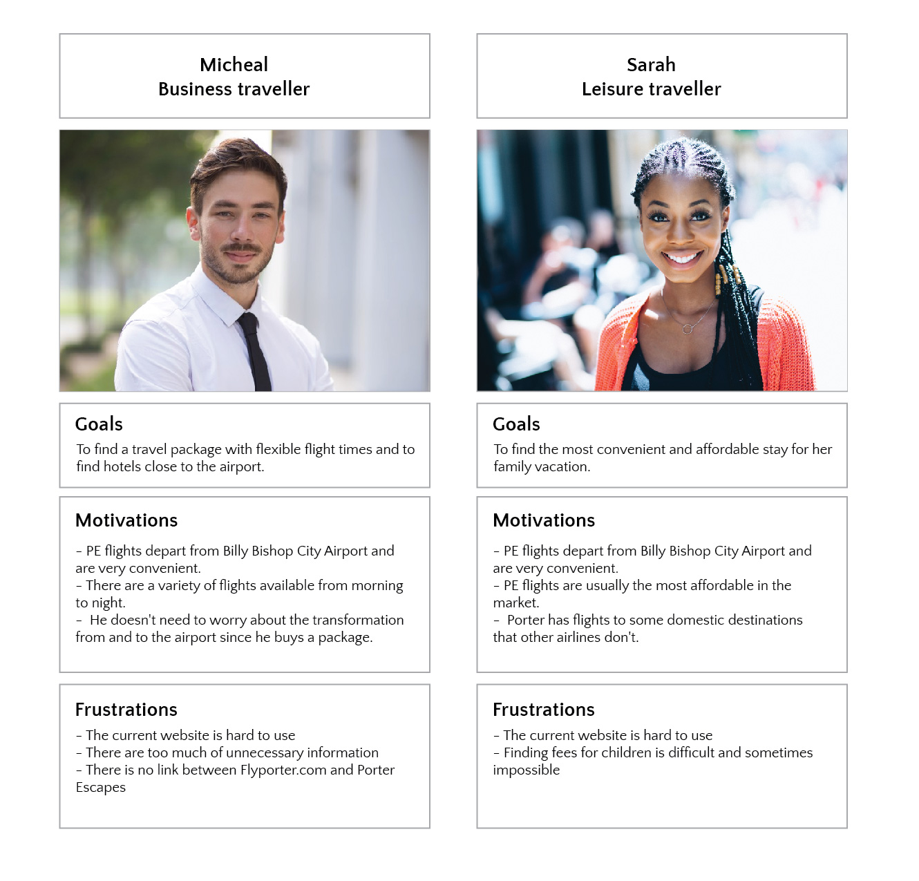
Who is the user?
There are 2 different types of users booking on Porter Escapes: One is business travellers and the other group is leisure travellers.
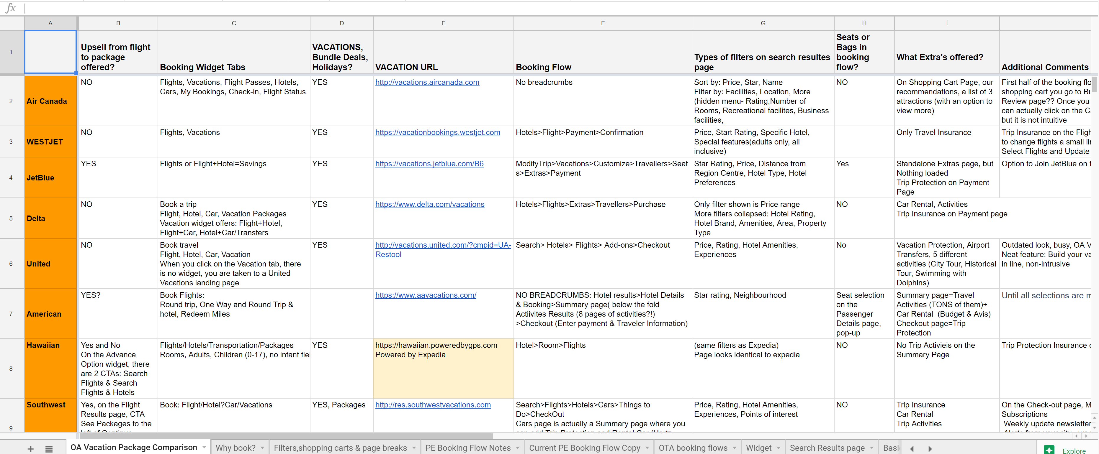
Competitive Research
Based on the research that’s been conducted over the course of the discovery phase, we realized that the most successful online travel agencies have a very simple flow where users only need to select from limited options, copy is simple and understandable, and finally the user interfaces are focused on anticipating what users might need to do and ensuring that the interface has elements that are easy to access, understand, and use to facilitate those actions.
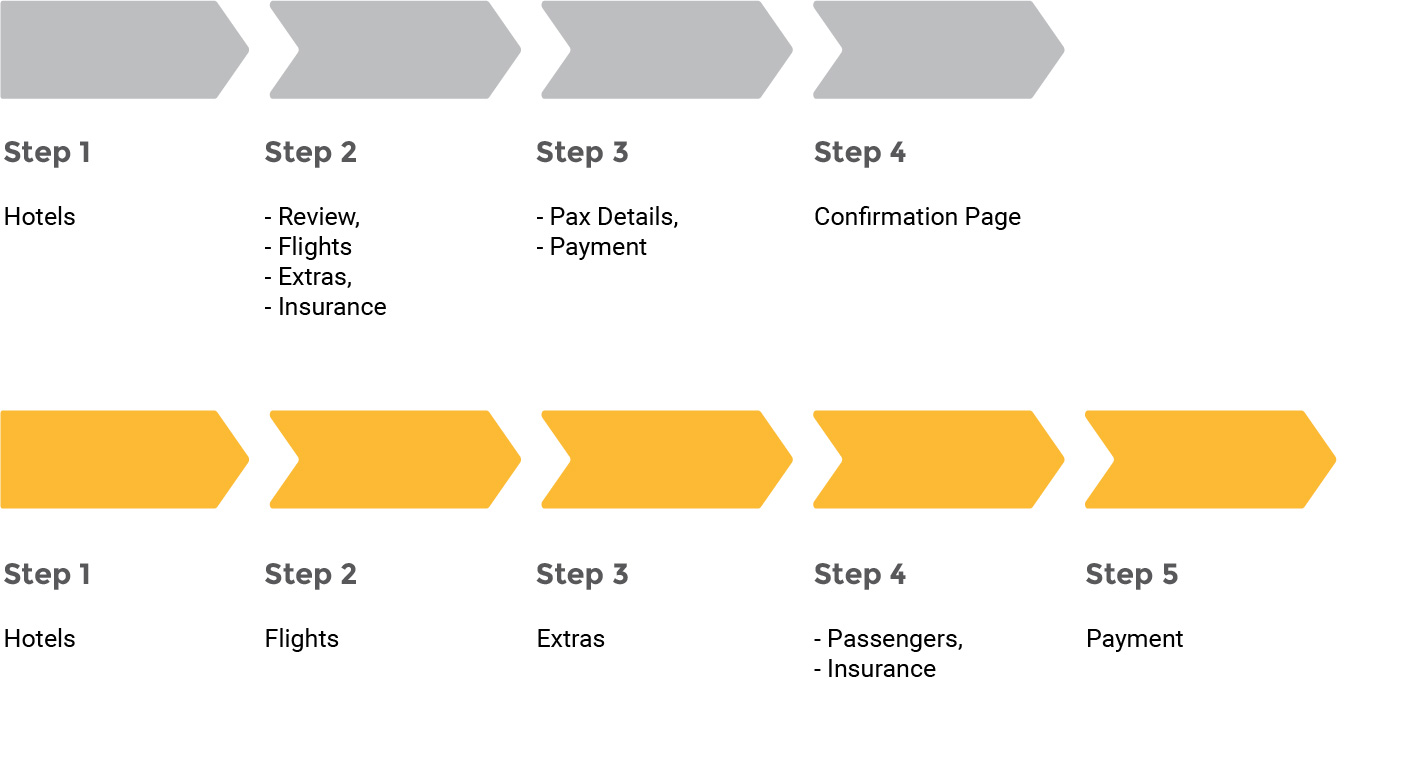
Current flow VS Recommended flow
From the result of the research we realized that we need to make changes to Porter Escapes current flow. Some of the steps in the current flow have so many sections, and for every one of those users needs to make a, and it would lead to cognitive overload. What we suggest is to separate travel extras from travel insurance by allocating a page just for extras and placing the insurance after passenger information page where users are ready to think about buying another thing. Also as payment genuinely is a sensitive step, so we decided to allocate a single page to it too.
Lets take a look at the old Porter Escapes flow
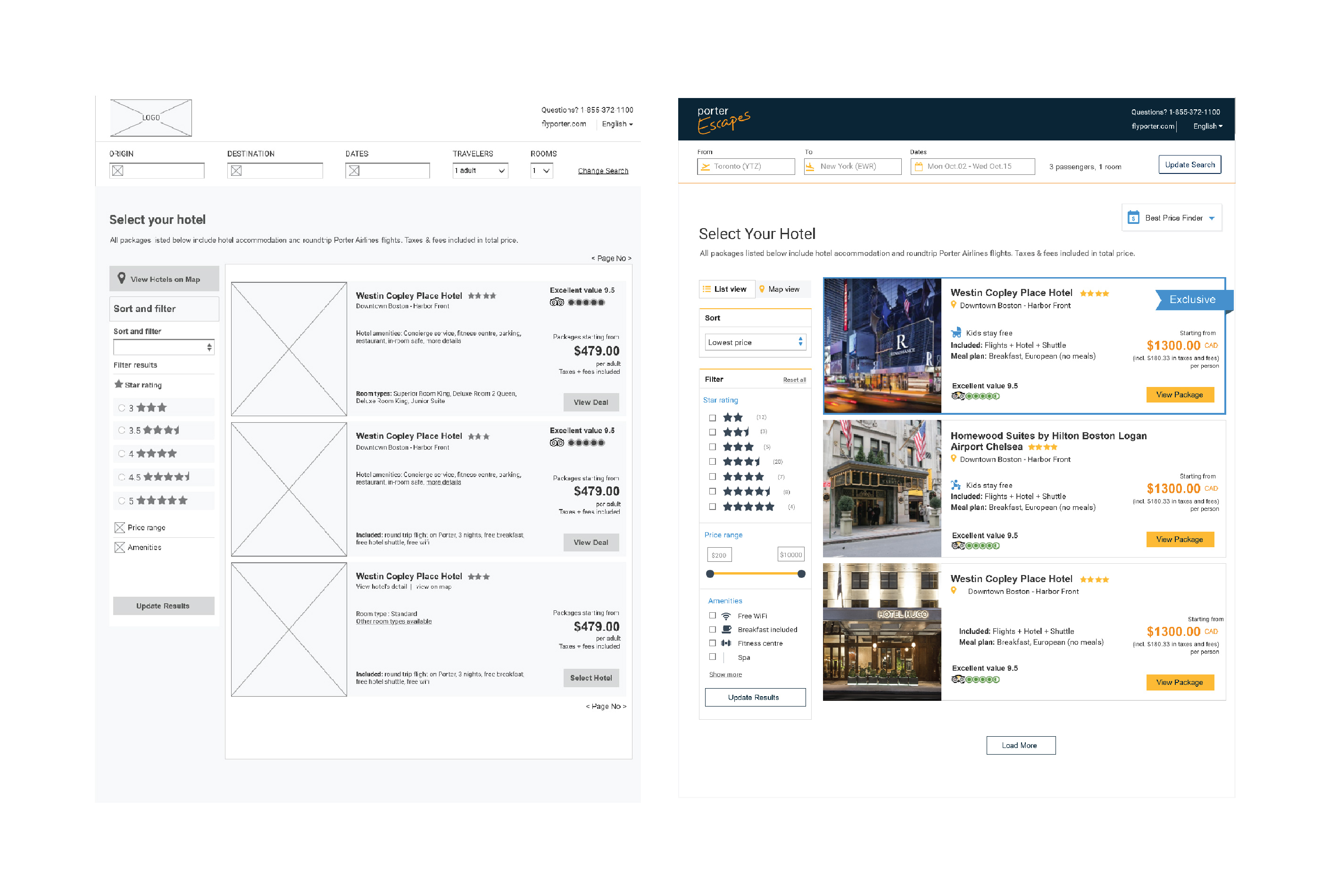
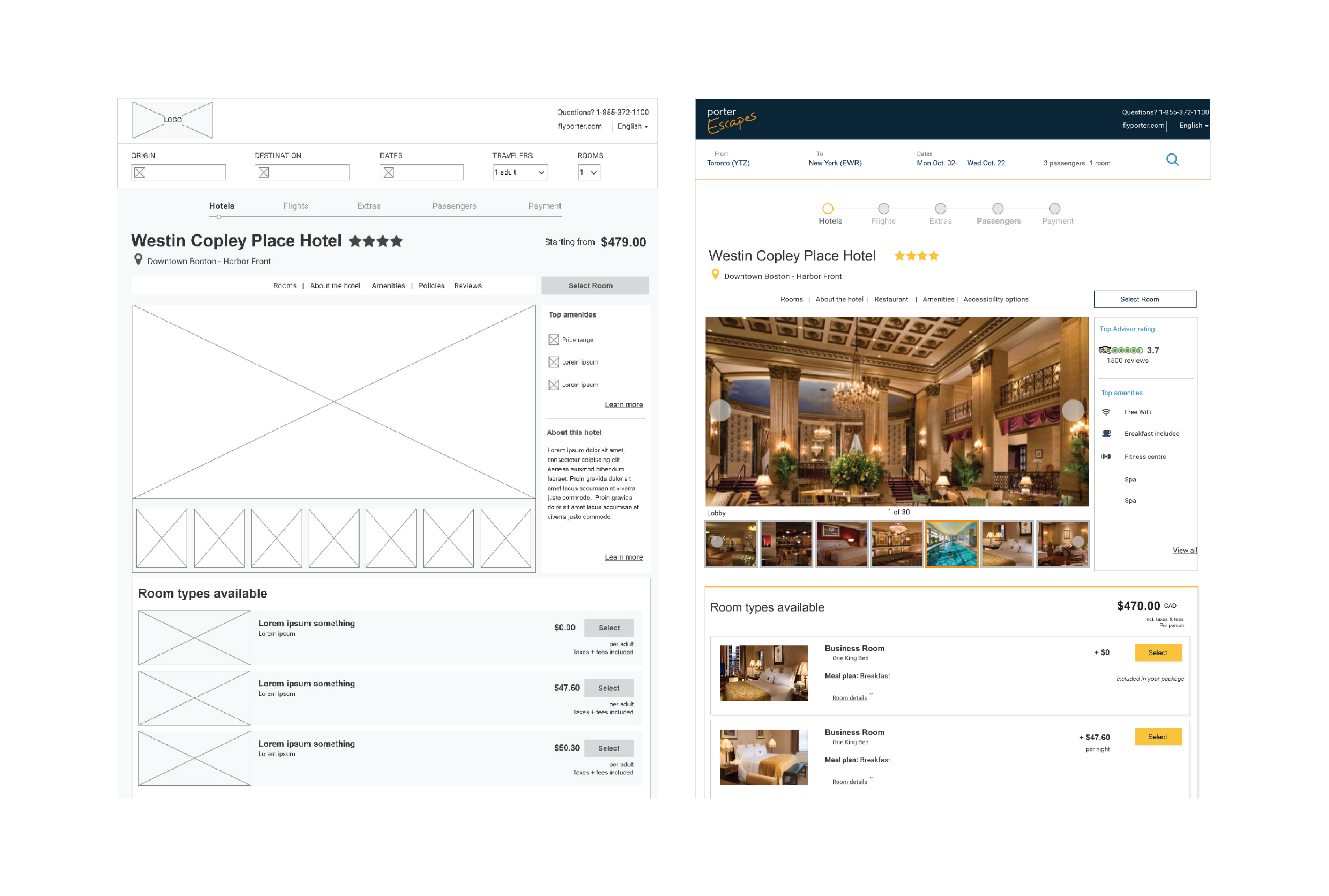
Hotel page
From the result of the research, we realized that we need to make changes to Porter Escapes current flow. Some of the steps in the current flow have so many sections, and for every one of those users needs to make a, and it would lead to cognitive overload. What we suggest is to separate travel extras from travel insurance by allocating a page just for extras and placing the insurance after passenger information page where users are ready to think about buying another thing. Also as payment genuinely is a sensitive step, so we decided to allocate a single page to it too.
Room page
In the old flow, there is no rooms page. After the hotel’s page, information about rooms, flights, experiences and insurance was shown on the same page. That was not practical at all because users were asked to select so many things in one place. After usability testing, we realized that most of the users tend to skip the experiences and insurance part.
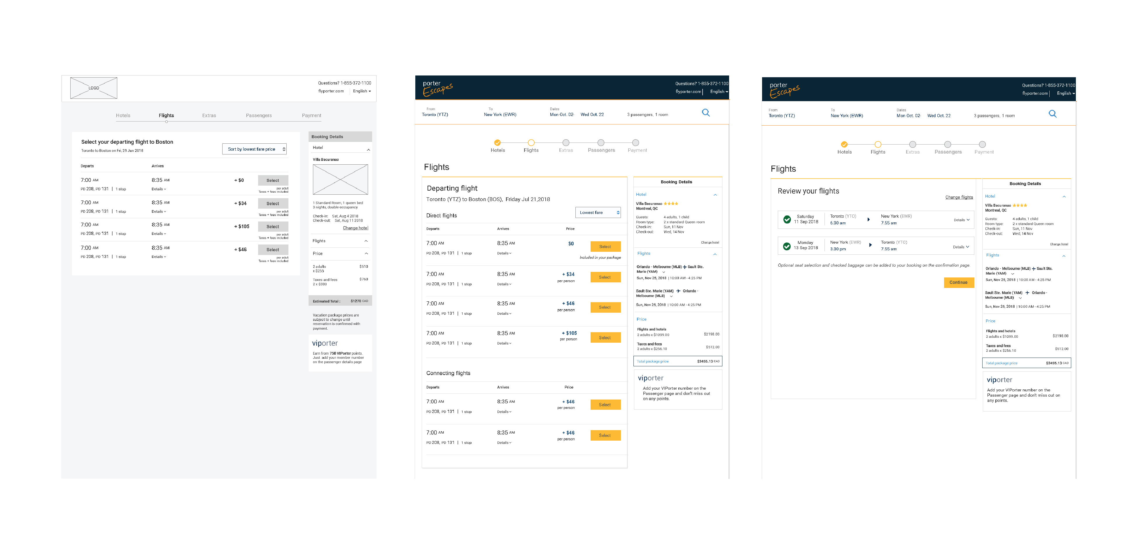
Flights page
In the new flow, we decided to separate the information and show them in different steps. We allocated a page to flights so that users can clearly see what other options they have to pick from. There is also a confirmation page right after the flight page so users can review their flights too.
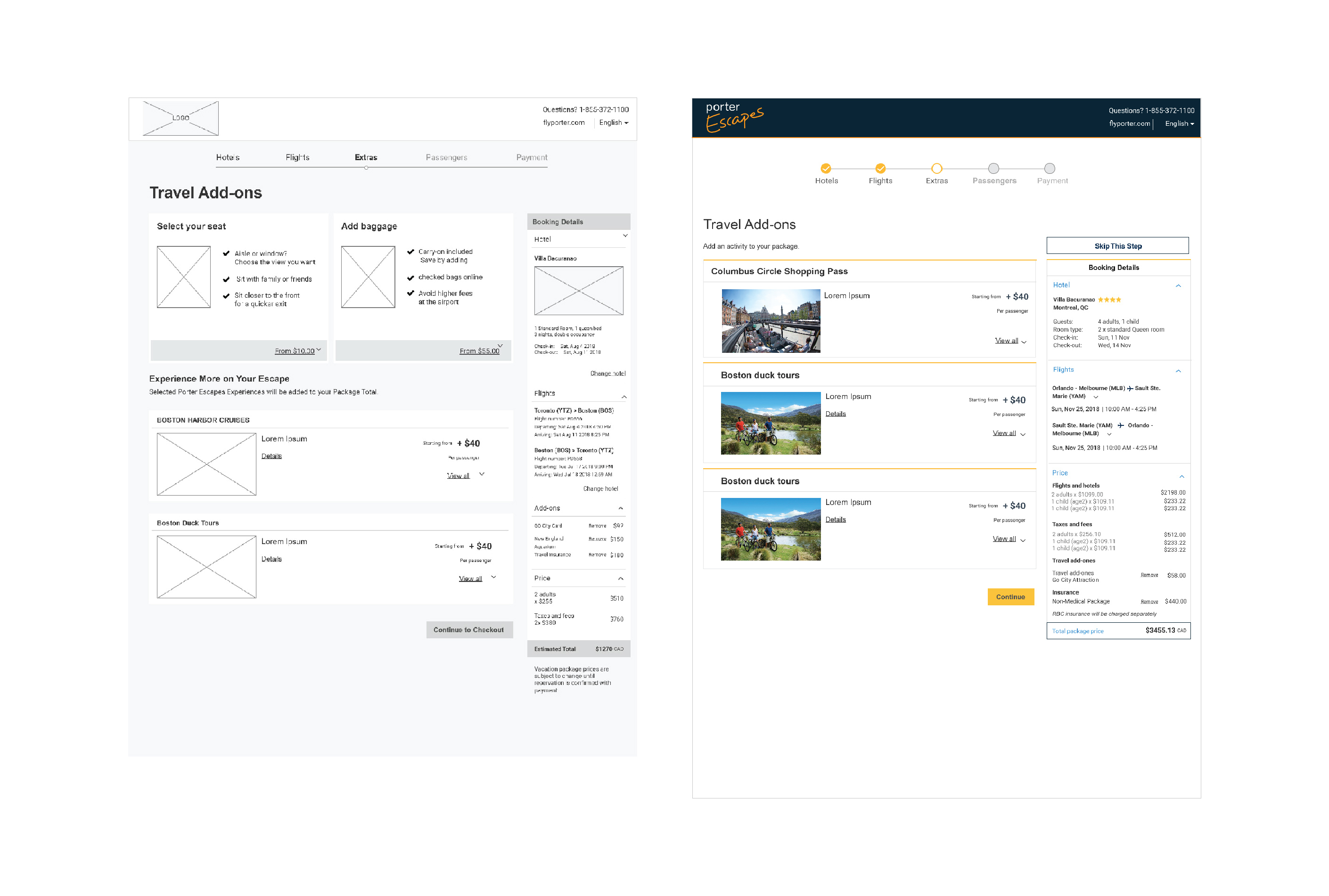
Travel add-ons
We also created a separate page for extras to give the users an opportunity to explore the available experiences in order to increase sales. There is a page for passenger’s information and insurance.
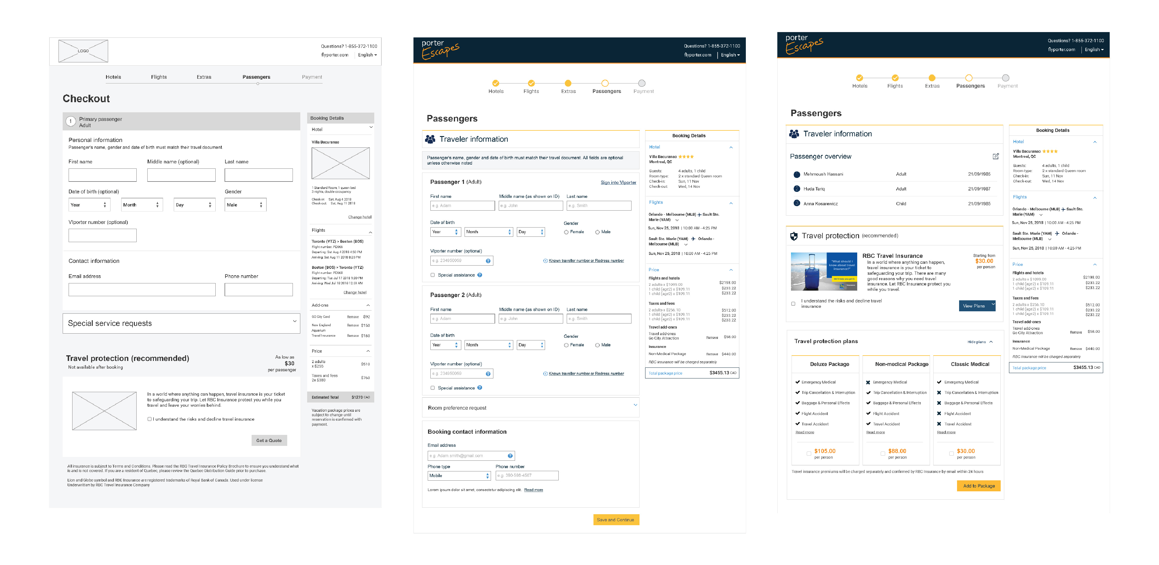
Passengers page
On the passenger’s page, we divided the page into two sections first being the passenger’s information form and second being the insurance section. This way, users will not see the insurance section until they are done with the first section. As a result, the whole page wouldn’t be overwhelming for users as they are given a chance to think about each section separately.
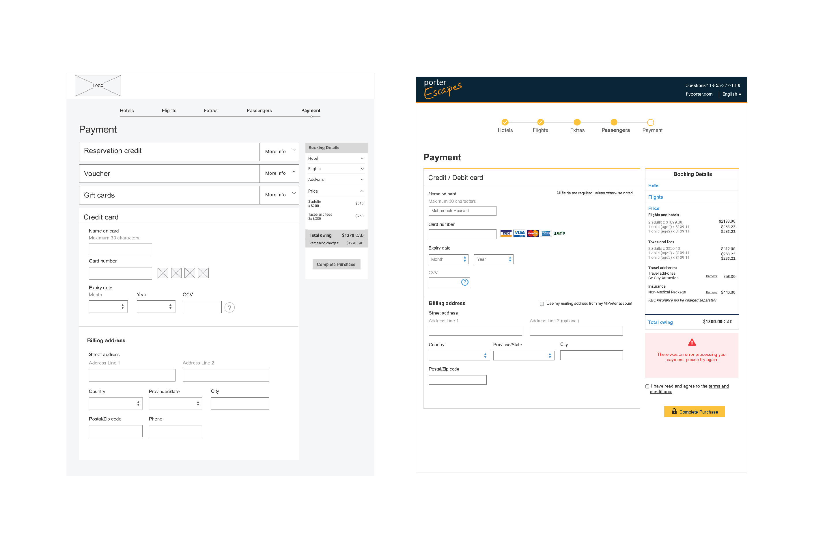
Payment page
Finally, a page for the payment as payment is a sensitive task for users and they need to concentrate on it.
Now let's take a look at the
actual website!